All of the content was there and I like the polka dot border. I agree with Ava on making the divs a little smaller. Something that could be improved on is the responsiveness.
Great color scheme! But, it is missing a title, and there needs to be subtitles to categorize the seniors and juniors, and there needs to be padding between the border of the boxes, and the text
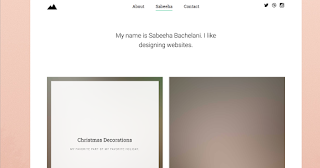
Space looks a little empty. You could of re-sized or cropped some of the photos in photoshop so they were squished. Page is not responsive. Overall though I really like your design, and the dashed line instead of solid.
responsiveness could use a little help, and there is a lot of empty space on the right side. All the information is there, and I like your color scheme.
responsiveness could use a little help, and there is a lot of empty space on the right side. All the information is there, and I like your color scheme.
I <3 your polka dots, and maybe making the boxes smaller would help look the page look less empty! (((((((((((((((((((((((:
ReplyDeleteAll of the content was there and I like the polka dot border. I agree with Ava on making the divs a little smaller. Something that could be improved on is the responsiveness.
ReplyDeleteUNTITLED DOCUMENT. Good color scheme. Maybe put some margin in between the divs? Not very responsive.
ReplyDeleteGreat color scheme! But, it is missing a title, and there needs to be subtitles to categorize the seniors and juniors, and there needs to be padding between the border of the boxes, and the text
ReplyDeleteNICE UNTITLED DOCUMENT (i say this because mine was too until a few minutes ago...)
ReplyDeleteThe names are a little close to the borders, but the style is great.
Good site but there doesn't seem to be any apparent order to the people.
ReplyDeletefun, flirty, fantastic!!! on another note, the font bothers me a little bit, it's a little boring compared to your colors. BUT EVERYTHING THERE!!
ReplyDeleteI like how you put the border to be a dashed line instead of a solid line. Your color scheme is nice and I liked the font you used
ReplyDeleteGood layout, better if it was a a little responsive but thats minor
ReplyDeleteSpace looks a little empty. You could of re-sized or cropped some of the photos in photoshop so they were squished. Page is not responsive. Overall though I really like your design, and the dashed line instead of solid.
ReplyDeleteresponsiveness could use a little help, and there is a lot of empty space on the right side. All the information is there, and I like your color scheme.
ReplyDeleteresponsiveness could use a little help, and there is a lot of empty space on the right side. All the information is there, and I like your color scheme.
ReplyDelete