Skip to main content
Mobile First-Smittys

 In this project, we recreated a website named Smittys. However, instead of working on the desktop version and decreasing the size of the format to fit a phone, we went "backwards". We create the Mobile version first. This process was a little bit tricky, as we had to rethink the way we design the website. We also had to think of the color scheme we should use. I decided to go with more springy greens and cooler tone colors. The site does have a girlier look, but I think that adds to the comfort of the site. The mobile first aspect of this project, although tricky at first, made designing the website much easier. All I had to do after designing the mobile was fix the size of the divs for the larger versions, such as the tablet and desktop version. I also needed to move the menu to the left, but I only need to change the width and the float left CSS. Overall, this project was probably the trickiest one I have done all year, but it was definitely one of the more rewarding websites that I have completed.

 In this project, we recreated a website named Smittys. However, instead of working on the desktop version and decreasing the size of the format to fit a phone, we went "backwards". We create the Mobile version first. This process was a little bit tricky, as we had to rethink the way we design the website. We also had to think of the color scheme we should use. I decided to go with more springy greens and cooler tone colors. The site does have a girlier look, but I think that adds to the comfort of the site. The mobile first aspect of this project, although tricky at first, made designing the website much easier. All I had to do after designing the mobile was fix the size of the divs for the larger versions, such as the tablet and desktop version. I also needed to move the menu to the left, but I only need to change the width and the float left CSS. Overall, this project was probably the trickiest one I have done all year, but it was definitely one of the more rewarding websites that I have completed.
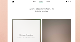
The post is absolutely fantastic! Lots of great information and inspiration both of which we all need! Also like to admire the time and effort you put into your blog. For more info visit
ReplyDeleteecommerce website development company | ECommerce Development Company in Bangalore|