Final Project Post
 Animation
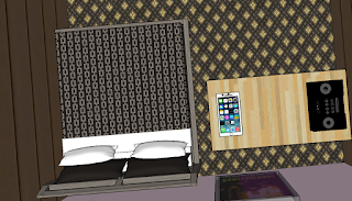
In this strand, I was the animation and setting designer. I had to think of a way to make the app be accentuated and what better way then in a bedroom where most of our homework is done.
The other people in my group did the content that led up to the final design of the room and product, but I put all the elements together to form the entire idea, and setting. This experience was challenging, yet very interesting, because it showed me how to manage my time properly, and make sure everyone's ideas and elements were included. This project did require some cooperation and everyone to contribute, if someone didn't, the project would fall, just like in the real world. I had the brunt of this part of the project on my shoulders. I had to figure out how to implement the idea if this helpful app, without using the cliche classroom. The colors in the bedroom add a subtle feel to the phone without distracting the viewer from the what the animation is suppose to be showing. The colors of the room compliment the phone very well, in my opinion. They make the phone stand out.
PhotoStudy Commercial I created the plot line and directed the video. The video was challenging to make since our group didn't have the graphics, the animation or the well thought idea to show in the commercial. Since I was the director, I had to think of a way to show the app gives helpful hints, and doesn't just straight up give you the answers. The others in my group either helped me with directing the video, or were actors showing the product. I also thought of the idea for the commercial, showing the sad boy wanting to play with his friend, who is miserable with not having anyone to play with. Not to worry, PhotoStudy will help. By giving helpful hints, the boy is able to get his homework done faster, and play with his friend more. I used Final Cut Pro to edit the video and make it the way I imagined it to be. Next time, I would make sure that we had all the correct shots to make it flow better.
PhotoStudy Logo
I was the logo designer. I was thinking of a way to show the product through the logo, and no better way then a camera and pencils. The others in my group helped come up with the other elements in the logo, like the camera. This rotation probably created the most teamwork since we were running to of time to have all the elements done. There were times when our grow didn't communicate very well, and it led to conflict in the group. We luckily overcame the problems somehow, but this rotation was probably the most stressful. The colors orange, blue, and red represent what the app does, Help in a calm way without rush or stress.


Comments
Post a Comment