3 Sites, Then and Now!
The two pictures at the bottom are what Wikipedia and the coding looked like
back in 2006. Both pages have similarities and differences. One similarity is the wikipedia logo is still the exact same as it was back in 2006. A difference is the globe. The globe now is 3-D and has different signs and symbols to show the different languages. The Wikipedia globe from 2006 is 2-D and is made up of different phrases.
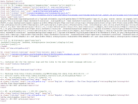
 Another difference is in the coding. The coding from the present Wikipedia page is much longer and descriptive. The one from 2006 is mainly script and variables. The one from the present has links and not much script or variables. The main page of the 2006 page is really a bunch of links and its very messy and disorganized. The present page has the languages displayed at the top and then just a search bar at the bottom. This looks cleaner and not so scattered.

Wattpad has changed in more ways than one. One difference is the way the stories are displayed on the homepage. They are in columns and have a blue link right next to them. Another difference is the design of the homepage itself. Although the logo hasn't changed, the color scheme has. The green tabs at the top are not there anymore. Neither are the green arrows or the go sign. The authors are not displayed on the homepage like they are on the present homepage. The present homepage is more interactive with the user than the past version. The top page is the 2007 version and the one at the bottom is the present version.
 The coding is definitely different in these two pages. The one at the top is the code from 2007 and the one at the bottom is the present coding. Many people would think these were switched, because of the less content on the bottom than on the top. In the 2006 version, there is a lot of script and meta and stuff that doesn't really need to be there. The present version has more divs and li classes. The same ideas were used in the two versions.
Youtube is the site to go to for all kinds of videos. There have been many changes though to how it looks. In the present format, there are not only videos from the people I am subscribed to, but also recommended Youtubers who have similar content. The colors the links were in the 2006 blue, and at the top. This was handy because they were easy to find. The present day format has the links to the side. The videos in the 2006 format are not labeled as recommendations. I think that the present version is more user friendly and more organized than the 2006 version.

The coding on top is Youtube from 2006. The one on the bottom is the coding from the present format. The present day format has more content than the 2006 version. This is probably because Youtube has way more videos now than it did back in 2006. There are more scripts and livs in the 2006 version than in the present version. The present version has many links and other things. The 2006 coding looks more organized than the present version. The present version has very long lines of script and such.

The Wayback machine is a internet tool that helps people find what some sites looked like in the past. The purpose of the Internet archive is to help people find other internet searches. Instead of going to like, 10 different websites, most of the info is already on the website. They archive info bout movies, animations, books, music, all kinds of categories. I think it is interesting that I can find documents on different pieces of art and find out about some of the smithsonians. This website is very versatile and I would use it in the future.


Comments
Post a Comment