Responsive Web Design Intro
A responsive web design is a web design that provides optimal viewing and interaction between the viewer and the device. Responsive Web Design has become very important, because as more mobile devices have internet, more people are using just those instead of a laptop or desktop. Media queries are CSS3 modules that allow fit content to fit the screen it is being featured on. Media queries are similar to breakpoints; although, breakpoints are the place and time where a change is made to the screen and the content on the screen.
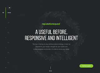
The picture to the right is what the normal desktop site looks like. The little circle surrounding the title is nice and large; the circle is also interactive to the mouse. The menu to the left scrolls when the its clicked on and when the mouse is scrolled on. The type is large and readable and in bright colors to be easily distinguished from the rest of the text.
The picture to the left is what this website would look like on a tablet or a mobile phone, Because of the small size of these screens, the menu had been pushed down to no more than two arrows in the bottom right corner of the page. These little green arrows control of when the slides move. The type has gotten smaller to fit the size of the screen. The interactive circle in the background, although has stayed the same size.
 The widest picture to the right would be what the website would look like if the desktop or laptop was at full screen or if this was shown on a large presentation screen. This picture isn't that much different from the normal size, except that its wider in length. The type does get larger, and the menu stays where it is.
The picture to the right is what the normal desktop site looks like. The little circle surrounding the title is nice and large; the circle is also interactive to the mouse. The menu to the left scrolls when the its clicked on and when the mouse is scrolled on. The type is large and readable and in bright colors to be easily distinguished from the rest of the text.
The picture to the left is what this website would look like on a tablet or a mobile phone, Because of the small size of these screens, the menu had been pushed down to no more than two arrows in the bottom right corner of the page. These little green arrows control of when the slides move. The type has gotten smaller to fit the size of the screen. The interactive circle in the background, although has stayed the same size.
 The widest picture to the right would be what the website would look like if the desktop or laptop was at full screen or if this was shown on a large presentation screen. This picture isn't that much different from the normal size, except that its wider in length. The type does get larger, and the menu stays where it is.
A Useful Before, Responsive and Intelligent:http://veille.reputationsquad.com/#accueil


Comments
Post a Comment